Commuting to work can be a grueling affair. On average, D.C. residents spend 28.85 minutes commuting to work. This is only slightly longer than the 27.2 minute average commute endured by the 50 largest metro regions in the U.S. and much shorter than the 33 minute average commute of suburbanites travelling into D.C. to work.
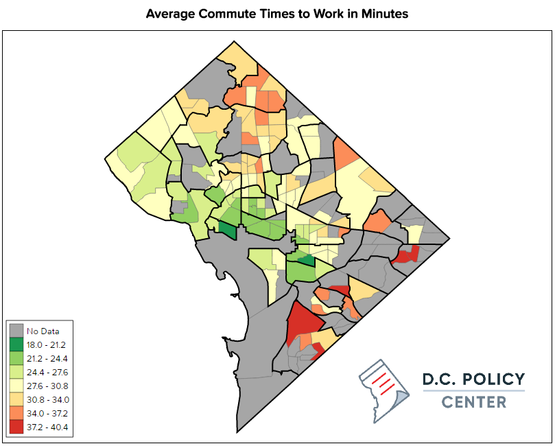
I’ve plotted the average commute times throughout D.C. to show the patterns that emerge in the data. The map below illustrates average commute time broken down by census tract. The data shows that areas downtown, like Georgetown and Capitol Hill have the shortest average commutes, all below 24.4 minutes, in the District. On the other end of the spectrum, neighborhoods like Brightwood, Petworth, and Anacostia experience longer commutes than the overall city average. The southeastern quadrant of the city has the longest commute times. For example, residents of the Marshall Heights neighborhood experience an average commute of almost 40 minutes. (Note: Some areas show as “No Data.” This is because the Census Bureau computes average commute times for only a sample of the city.)
Erratic traffic, metro delays, and unreliable buses all affect the length of the daily commute for many residents. Certain portions of the city see longer commute times than others. In my analysis I discovered much of this is related to factors such as median household income and method of travel to work.
Analysis
While the average District resident spends 28.85 minutes commuting to work, 21 percent of residents commute between 30 to 34 minutes. This constitutes the largest percentage in a breakdown of overall commute times. A sizable portion of residents (28 percent) commute between 15 to 24 minutes every day. On the extreme end of the scale, 9 percent of residents travel greater than 60 minutes to get to work.
Looking at the average commute map, I wonder, why do certain sections of the District see much higher average commute times?
Regression Analysis
To answer my question, I ran a regression analysis to find what variables are most likely to influence average commute time for each census tract throughout the District. Starting with a staggering 140 socioeconomic factors, my regression was reduced down to the six most influential variables:
- Median Household Income,
- Percent of commuters traveling by car,
- Percent of commuters traveling by bus,
- Percent of commuters that walked,
- Percent of the population in the age group ages 5-9, and
- Percent of the population in the age group ages 45-49
The regression model has an R2 of 0.78, indicating there is a correlation between the variables and the average commute times. Below, is a scatterplot display a sample of the prominent model variables, using Census data.
The regression analysis scatterplot plots the estimated commute times of the model compared with the actual commute times. I noticed a few outliers in the group. These outliers had extreme standard residuals, meaning they had commute times either much shorter or far longer than estimated. These outliers are emphasized in orange on the plot below. The outliers include Georgetown, whose average commute is 3 minutes shorter than the estimate, and Anacostia, which has a commute almost 4.5 minutes longer than the estimate.
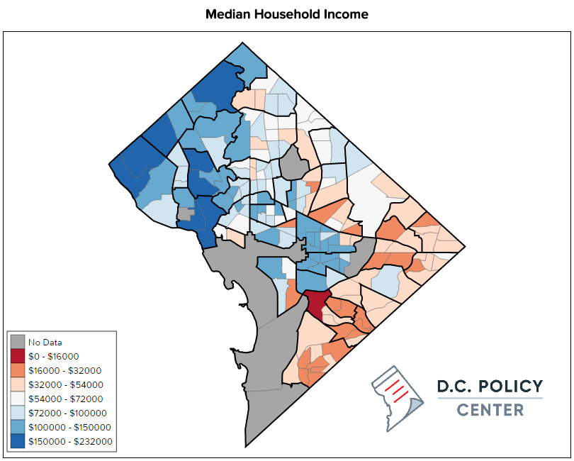
Median Household Income
Next, I wanted to examine a few of these variables in further detail to show how they are distributed throughout the city and how they might influence average commute times. I plotted the variables on the series of maps below. The first variable of significance is median household income. In previous post I have already discussed the disparity in income that exists in D.C. For example, neighborhoods in the western half of the District, like Spring Valley, Palisades, and Georgetown earn a significantly higher average income than neighborhoods in the Eastern half, like Barry Farm, Fort Stanton, and Congress Heights.
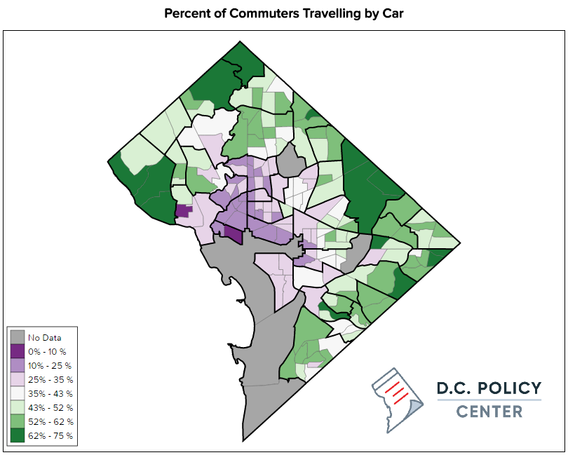
Commuters traveling by car
Mapping the percent of commuters traveling by car shows a divide in the city but is unlike the divide observed in the median household income map. My map below shows that the greatest percent of commuters that travel by car live in the out extents of the city. On the map, these commuters form a green ring or belt around the District. Closer to the city center the percentage of commuters by car typically falls below 25 percent.
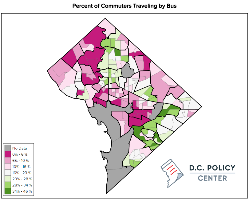
Commuters traveling by bus
Lastly, I looked at the percent of commuters traveling by bus. Overall, just less than 17 percent of commuters travel by bus. The map below shows that there are clusters of bus commuters along the 14th and 16th Street corridors, Columbia Heights, and Brightwood for example, and neighborhoods in the Southeast, like Anacostia and Barry Farm, that have a higher percentage of commuters by bus. These clusters are likely explained by the absence of metro stops.
Conclusion: How much you make and how you travel to work are related to your commute times
The model indicated that 78 percent of the geographic variation is explained by the six variables I analyzed. The relationships in the visualizations are easy to observe. For instance, the neighborhoods of Petworth and Brightwood have a high percentage of commuters by bus, as well as average commute times that are at the higher end of the spectrum. In this case it is possible to theorize that because buses make so many stops, often every few blocks, average commute times will increase. Additionally, it is important to consider that commuters from neighborhoods like Barry Farm, which have low rates of car ownership, a car are much more likely to commute by bus when metro is not an option.
The Data
Data for median household income, method of commute, and average commute times were obtained from the U.S. Census Bureau’s American Community Survey 1-year estimates for 2015. Visit my GitHub page for code used in each visual.