Where people live in an urban area reflects economic opportunity and wellbeing. To anyone who has felt the awful crawl of traffic on K Street during rush hour or tried to order a sandwich at noon during the lunch rush, it becomes very evident that downtown Washington – an area of no more than a few square miles – fosters a substantial share of commerce in the district. The scope of the central business district, however, is even more profound when considered outside the anecdotal lens. Although development doesn’t strictly follow a uniform pattern from the center outward, access to a bustling business center is still one of the largest determinants of who lives where and why.
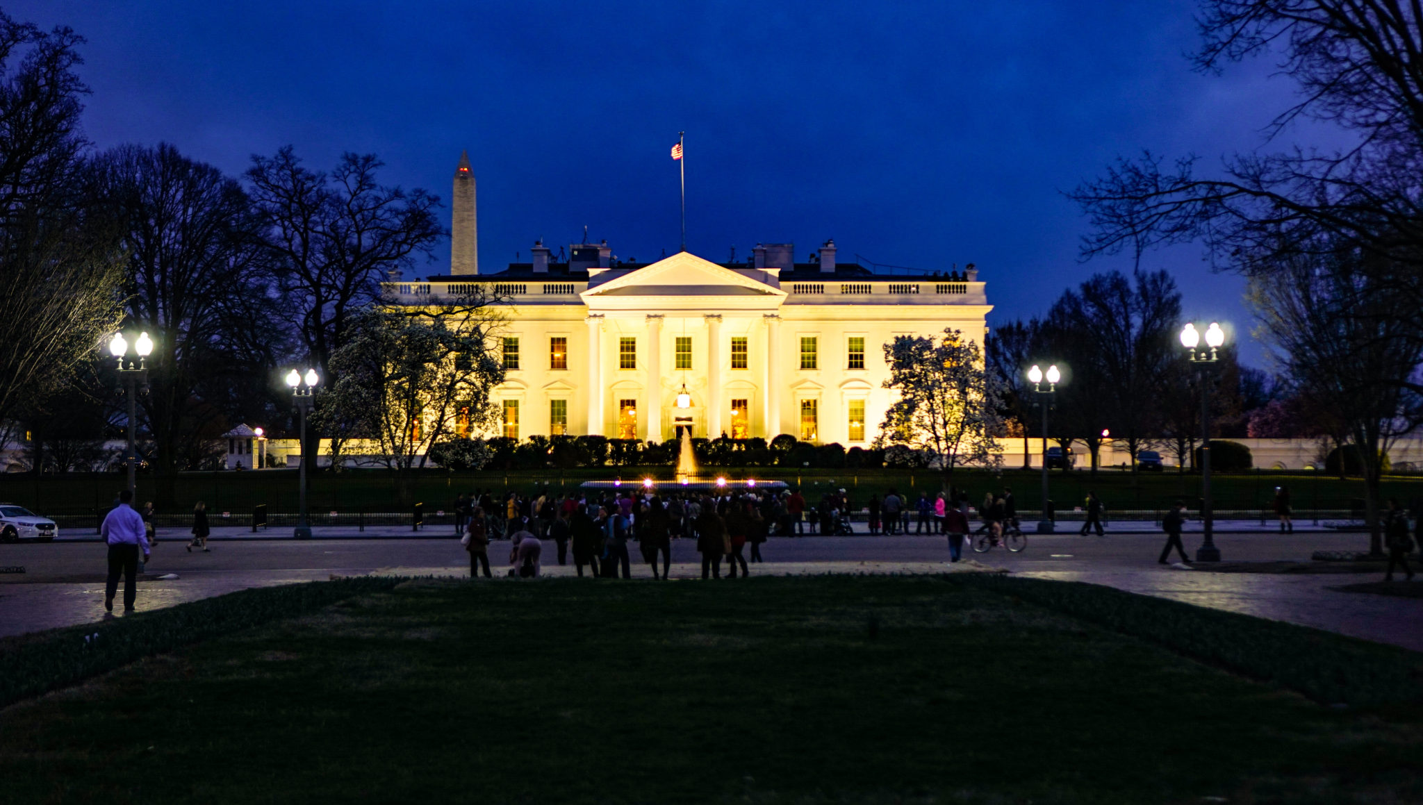
Using Geographic Information Systems and publicly available data, we can quantify just how much of D.C.’s economy is concentrated within the city center and how the city’s demography changes as one moves away from that center. Our analysis employs the White House as the geographic center of Washington. This choice is somewhat poetic, but also quite practical: The White House, centrally located between federal agencies and a traditional downtown, is a nucleus of the private, non-profit, and public sectors.
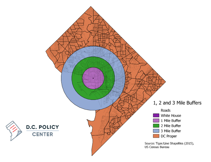
Looking at the White House as the center of D.C.The 1-, 2-, and 3-mile “buffers,” or zones, around the White House
|
How proximity to the White House shapes your economic environment
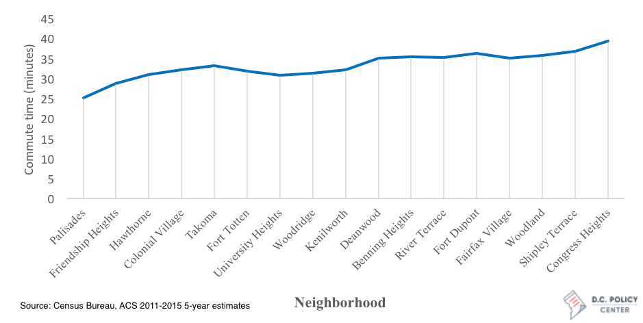
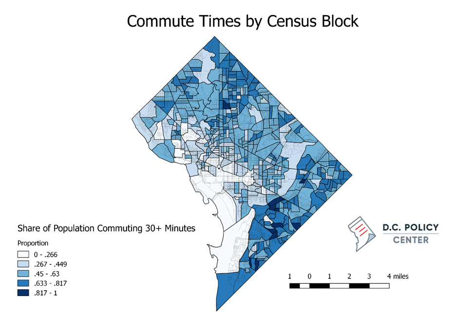
One advantage of living closer to the city center is having a shorter commute. An analysis of census block groups by proximity to the White House show that this holds true in the District. Only 34 percent of District residents who live within one mile of the White House commute more than 30 minutes to work. In contrast, almost half (46 percent) of D.C. residents who live within 3 miles of the White House spend more than 30 minutes commuting each way. Some of these differences have to do with zoning and development trends: In residential parts of the city, longer commuting times are more likely since by design these areas do not have much in the way of offices. But still we see big differences across commuting times—as one begins in the northwestern tip of the city and travel clockwise following the border, the average commute times increase from 25 minutes in the Palisades neighborhood to 39 minutes in Congress Heights.
Commute time for neighborhoods around D.C.Clockwise, by neighborhood
|
Beyond employment and commute times, proximity to the city center yields significant differences in rents, education, income, and race/ethnicity. The demographic make-up of the locations within one mile of the White House is very different from the rest of the city. For example, in this area, only 13 percent of residents are African American, compared to 50 percent for the entire city. The disparity remains even at greater distances – block groups within 3 miles of the city center are still only approximately 30 percent African American.
Proximity is Just One Component of D.C.’s Economic Environment
Geographic proximity, despite its merits, only scrapes the surface of accessibility to employment, services, and goods. Transportation, cost of living, crime rates, school districts, and social structures play a tremendous role in the spatial distribution of individuals in larger cities; for simplicity’s sake, we have not, in this piece, incorporated these features in the analysis. Further, development and access don’t follow a uniform distribution from a central node; very prominent divisions exist as one travels from east to west in Washington, D.C.
Commute times, education levels, and race by proximity to the White House |
||||
| Distance from White House | ||||
| Variable | 1 Mile | 2 Miles | 3 Miles | All of D.C. |
| Share with commute over 30 minutes (%) | 36 | 42 | 46 | 51 |
| Share with Bachelor’s degree or higher (%) | 77 | 76 | 70 | 55 |
| Share African American residents (%) | 17 | 26 | 31 | 50 |
| Average (mean) rent | $1,759 | $1,700 | $1,629 | $1,446 |
| Source: Census Bureau, ACS 2011-2015 5-year estimates | ||||
About the data
All the demographic, economic, and spatial data used in this post are from the U.S. Census Bureau. Population and education variables are from the 2011-2015 5-year American Community Survey (ACS) estimates, and business data are from the 2014 business survey data for Zip codes or Census-provided shapefiles. I used QGIS, an open source GIS software to conduct all of the analyses. In order to calculate the share of a population in any given group, I created three circular buffers within 1, 2 and 3 miles of the White House. Using proportional allocation for polygons that were incomplete within the buffer, I assumed an even population distribution within the Census block or Zip code and multiplied by the area’s proportion.