In my inaugural article for the D.C. Policy Center I noted that from 1950 to 2010, as the region’s central city, Washington DC had lost 25 percent of its population “by nose count but [that was] offset by a 19 percent increase to total households.”
How can that be?
You can discover much of the answer for yourself by paying attention to all the high-rise apartments and condominiums that have sprung up in NoMA in the past two decades. They are filled not with larger families but with singles, mingles, and some empty nesters (who have moved back into the District after raising and educating their children in the suburbs).
In fact, D.C.’s population resurgence—we had an “unbroken string of 11 years of population growth since 2005”—has been so strong that updated data to 2015 show that, once strong growth years are included, since 1950 D.C.’s nose count drop is 16 percent, and the household count increase is 26 percent. From a local government perspective, the District has one-quarter more residential taxpayers than it had almost seven decades ago. That’s good fiscal news.
Over these past 65 years, average household size in D.C. shrunk from 3.19 persons per household to 2.24 persons per household. That’s almost a 30 percent reduction. Families are having fewer children and the proportion of single-parent families has grown. With greater prosperity, more young adults are living independently from their families; with more generous retirement incomes and Medicare so are elderly parents. Many newcomers are moving in not with young families (as the soon-to-be three child Rusks did 54 years ago), but as one-person households (42 percent of all D.C.’s households).
The upshot is that if keeping nose count up were truly the goal, D.C. would have needed 30 percent more households by now just to maintain its historical peak population of 802,158 in 1950.
The table I append at the bottom (and you can download it) looks at the demographic paths followed by the 50 central cities at the heart of the country’s 41 largest urbanized areas that I analyzed in the inaugural article. The list is organized by city population change from 1950 to 2015 with Las Vegas (with its population increasing almost 25-fold) being at the top and St. Louis and Detroit (which lost almost two-thirds of their population) being at the bottom.
Cities with growing populations have stronger household growth, too.
The general pattern is that cities with a growing population added households at an even faster rate; cities losing population lost households at a slower rate. Overall, household size dropped in 46 of the fifty cities, averaging a 21 percent reduction.
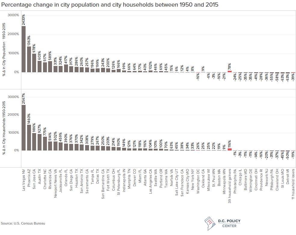
However, four California cities increased their average household size modestly: San Jose and Los Angeles by 1 percent; Riverside by 7 percent; and San Bernardino by 13 percent. The reason: major increase in each city’s Hispanic population. In 35 years San Jose’s Hispanic population jumped from 22 percent to 32 percent; Riverside’s from 16 percent to 50 percent; San Bernardino’s from 25 percent to 63 percent; and Los Angeles’s, from 27 percent to 49 percent. Hispanic households have tended to have larger, even multi-generational families.
Of the 34 cities that gained both population and households, 31 are “elastic” cities that expanded their boundaries significantly either through annexation or, in the cases of Jacksonville and Indianapolis, city-county consolidation (as Denver, San Francisco, Philadelphia, New York City, and, in effect, the City of Washington had done in the 19th century).
Washington, D.C. fell into the small group of post-WWII “inelastic” cities with St. Paul, Boston, Milwaukee, and Minneapolis which lost population but gained households: fewer noses but more taxpayers. Net household growth has been primarily fueled by gentrification. Though today’s smaller households have fewer mouths to feed and backs to clothe, most singles, mingles, and empty nesters have more discretionary income to spend.
Central cities that are truly hurting are the eleven that have lost both population and households: Philadelphia, Chicago, Providence, Baltimore, Wilmington, Newark, Cincinnati, Pittsburgh, Cleveland, St. Louis, and Detroit. That’s almost a roll call of America’s most distressed cities. All contain a handful of gentrifying neighborhoods they promote and celebrate but city-wide they are in decline.
Fiscal implications of household losses are significant
Residential property accounts for about 70 percent of a typical city’s property tax base so there are fiscal consequences to losing households. Let’s see how Moody’s Investors Service awards its ratings for tax-backed General Obligation bonds. (You might consider this a city’s “credit rating.”).
Aaa is the best possible, “blue chip” rating. Ratings proceed down the scale: Aa1, Aa2, and Aa3 (excellent/good); A1, A2, and A3 (average/mediocre); Baa1, Baa2, Baa 3 (below average/ poor); to Ba1, Ba2, Ba3 and B1, B2, B3 (junk bond levels).
The lower on the scale a city’s bonds are rated, the higher the interest rate it must pay to compensate investors for greater risk of non-repayment.[1] Having a low bond rating costs a city – in reality, its property taxpayers – more to borrow money to repair streets, build new or upgrade police substations, firehouses, recreation centers and senior citizen centers, etc.
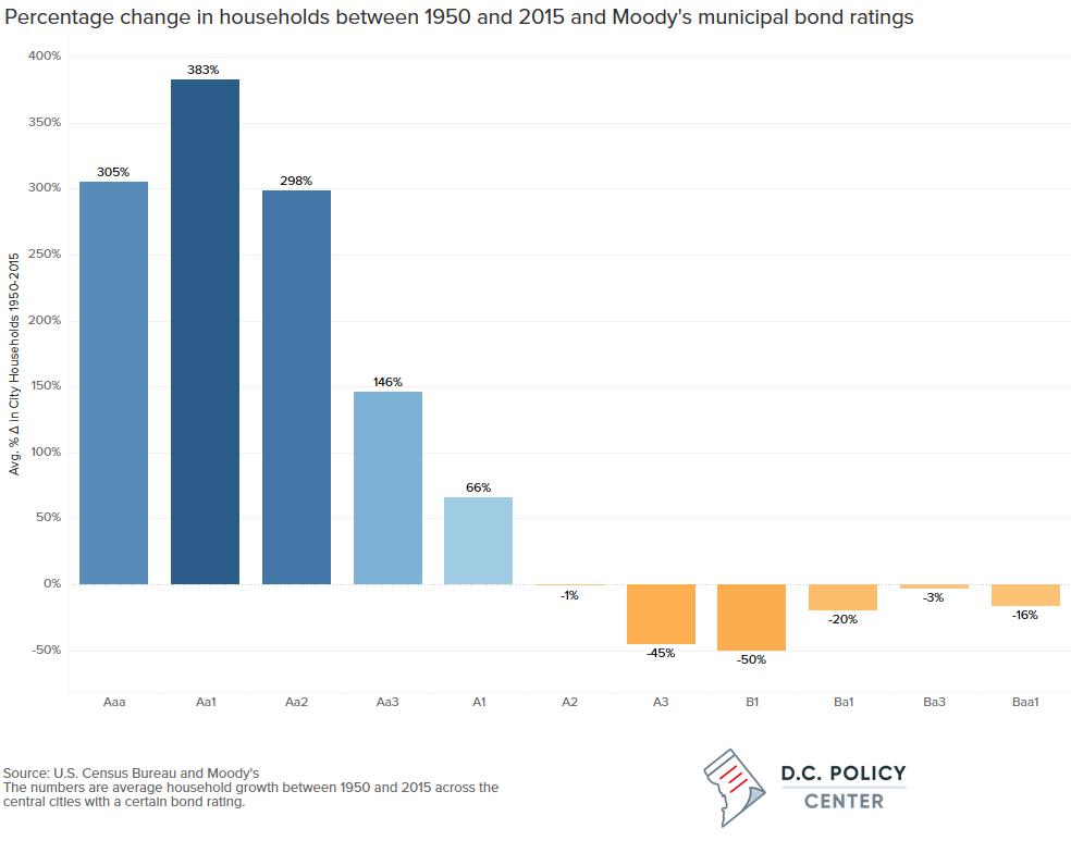
The eleven household-losing cities average A3 bond ratings (mediocre). Population-losing but household-gaining Washington, DC and its four mates average Aa1 bond ratings (excellent).[2] Thirty-one population-gaining and household-gaining cities also average Aa bond ratings (this group includes eight of the nine “blue chip” cities).[3]
Of course, rating agencies take more than just trends in residential assessed valuation into account in determining level of risk associated with municipal bonds. A city’s current debt level, budgetary prudence, professionalism of its fiscal management, etc. are all factors to be considered.
A generation ago DC had a Ba1 bond rating. By 2002 D.C.’s bond rating was Baa1 and would rise further to A3 by 2010. D.C.’s bond rating is now Aa1.
All credit to better fiscal management, but the District’s current demographics, which are different from that earlier era, matter too. In 1989, the District’s per capita income was 87 percent of suburban levels. With gentrification, the city-to-suburb income level rose to 94 percent in 1999; to 99 percent in 2009; and to 114 percent by 2014.
In short, as measured by relative per capita income levels, Washington, DC is richer than its suburbs.[4]
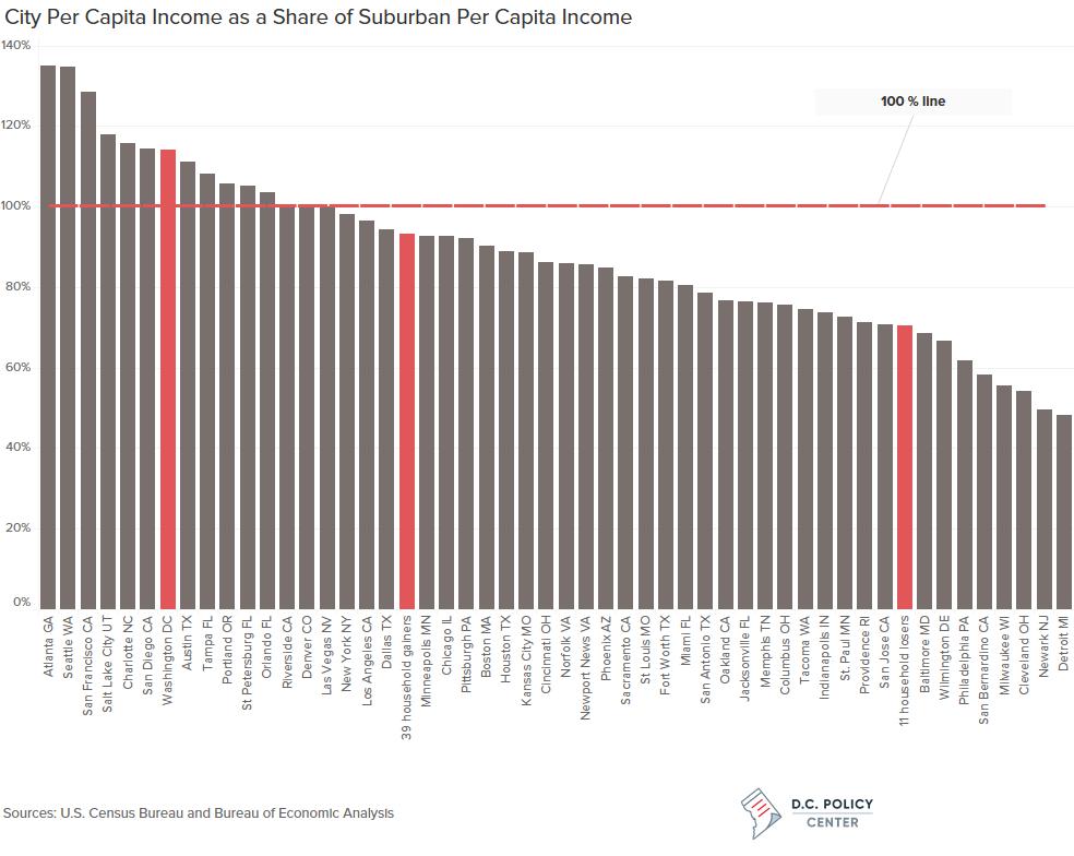
So, if someone tells you that Washington, D.C. is a distressed city, since you now know that, per your D.C. Policy Center Fact Checker, D.C. has a Aa1 bond rating and per capita income of $50,187 (14 percent higher than its suburbs and exceeded only by Seattle and San Francisco), you can award that someone three Pinocchios.
Why not the full four Pinocchios? Because there is still a real problem. Let’s unpack D.C.’s per capita income statistic. White, non-Hispanic per capita income ($83,742) is more than three times higher than black per capita income ($26,409).
The shadow of racial inequality still clouds the Nation’s Capital. Race as well as sprawl has shaped America’s growth patterns, I told the Metropolitan Washington Council of Governments back in December 1999… and it still does.
Data
The discussion in this post is based on the data below. You can download it in excel format here.
| Central City | City Population 1950 | City Population 2015 | % Δ in City Population 1950-2015 | City Households in 1950 | City Households in 2015 | % Δ in City Households 1950-2015 | Average Household size in 1950 | Average Household size in 2015 | % Δ in Average Household Size 1950-2015 | Single Person Households in 2015 | Latest City Bond Rating (Moody’s) | Moody’s bond rating numerical equivalent | City per capita income as a percenage of suburban per capita income in 2015 |
| Las Vegas NV | 24,624 | 623,769 | 2433% | 8,264 | 220,418 | 2567% | 2.98 | 2.79 | -6% | 31.6% | Aa2 | 8.0 | 100% |
| Phoenix AZ | 106,818 | 1,563,001 | 1363% | 34,245 | 534,199 | 1460% | 3.12 | 2.89 | -7% | 28.3% | Aa1 | 8.5 | 85% |
| San Jose CA | 95,280 | 1,026,919 | 978% | 29,757 | 323,133 | 986% | 3.09 | 3.13 | 1% | 19.5% | Aa1 | 8.5 | 71% |
| Austin TX | 132,459 | 931,840 | 603% | 35,538 | 364,893 | 927% | 3.24 | 2.50 | -23% | 34.3% | Aaa | 10.0 | 111% |
| Riverside CA | 46,764 | 322,423 | 589% | 15,051 | 92,408 | 514% | 3.11 | 3.34 | 7% | 21.6% | nr | nr | 101% |
| Charlotte NC | 134,042 | 827,121 | 517% | 36,899 | 322,872 | 775% | 3.63 | 2.52 | -31% | 32.4% | Aaa | 10.0 | 116% |
| Orlando FL | 52,367 | 270,917 | 417% | 16,794 | 82,241 | 390% | 3.12 | 1.27 | -59% | 31.8% | Aa1 | 8.5 | 104% |
| Newport News VA | 42,358 | 182,385 | 331% | 11,727 | 70,546 | 502% | 3.61 | 2.46 | -32% | 32.3% | Aa1 | 8.5 | 86% |
| Jacksonville FL | 204,517 | 868,031 | 324% | 57,907 | 323,488 | 459% | 3.53 | 2.62 | -26% | 30.0% | Aa2 | 8.0 | 77% |
| San Diego CA | 334,387 | 1,394,907 | 317% | 104,508 | 497,663 | 376% | 2.91 | 2.73 | -6% | 28.7% | Aa2 | 8.0 | 114% |
| Houston TX | 596,163 | 2,298,628 | 286% | 180,655 | 849,974 | 370% | 3.20 | 2.66 | -17% | 31.7% | Aa3 | 7.5 | 89% |
| San Antonio TX | 408,442 | 1,469,824 | 260% | 111,960 | 494,344 | 342% | 3.65 | 2.93 | -20% | 29.3% | Aaa | 10.0 | 79% |
| Sacramento CA | 137,572 | 490,715 | 257% | 43,383 | 177,131 | 308% | 2.93 | 2.73 | -7% | 31.3% | Aa2 | 8.0 | 83% |
| San Bernardino CA | 63,058 | 216,137 | 243% | 20,147 | 70,560 | 250% | 3.13 | 3.55 | 13% | 20.7% | 58% | ||
| Fort Worth TX | 278,778 | 836,969 | 200% | 85,555 | 285,173 | 233% | 3.11 | 2.88 | -7% | 27.3% | Aa2 | 8.0 | 82% |
| Dallas TX | 434,462 | 1,300,082 | 199% | 135,123 | 495,362 | 267% | 3.11 | 2.59 | -17% | 34.3% | A1 | 6.5 | 94% |
| Tampa FL | 124,681 | 369,028 | 196% | 38,146 | 144,582 | 279% | 3.27 | 2.47 | -24% | 35.8% | Aa1 | 8.5 | 108% |
| St Petersburg FL | 96,738 | 257,088 | 166% | 35,773 | 103,788 | 190% | 2.70 | 2.42 | -11% | 37.6% | Aa2 | 8.0 | 105% |
| Columbus OH | 375,901 | 849,067 | 126% | 109,775 | 344,839 | 214% | 3.17 | 2.40 | -24% | 36.3% | Aaa | 10.0 | 76% |
| Los Angeles CA | 1,970,358 | 3,971,896 | 102% | 665,752 | 1,360,164 | 104% | 2.82 | 2.86 | 1% | 30.1% | Aa2 | 8.0 | 97% |
| Indianapolis IN | 427,173 | 848,423 | 99% | 131,825 | 328,431 | 149% | 3.13 | 2.53 | -19% | 39.0% | Aaa | 10.0 | 74% |
| Miami FL | 249,276 | 440,989 | 77% | 78,612 | 171,720 | 118% | 2.97 | 2.50 | -16% | 41.1% | Aa3 | 7.5 | 81% |
| Portland OR | 373,628 | 632,187 | 69% | 126,653 | 253,820 | 100% | 2.81 | 2.43 | -14% | 34.4% | Aaa | 10.0 | 106% |
| Memphis TN | 396,000 | 655,760 | 66% | 113,233 | 250,324 | 121% | 3.35 | 2.55 | -24% | 35.1% | Aa2 | 8.0 | 76% |
| Denver CO | 415,786 | 682,545 | 64% | 130,172 | 287,074 | 121% | 2.99 | 2.33 | -22% | 37.8% | Aaa | 10.0 | 100% |
| Seattle WA | 467,591 | 684,443 | 46% | 154,511 | 311,038 | 101% | 2.79 | 2.13 | -24% | 37.9% | Aaa | 10.0 | 135% |
| Tacoma WA | 143,673 | 207,950 | 45% | 48,088 | 81,647 | 70% | 2.90 | 2.48 | -14% | 36.2% | Aa3 | 7.5 | 75% |
| Atlanta GA | 331,314 | 463,875 | 40% | 92,798 | 200,503 | 116% | 3.35 | 2.15 | -36% | 50.3% | Aa1 | 8.5 | 135% |
| Norfolk VA | 213,513 | 246,393 | 15% | 53,978 | 87,819 | 63% | 3.27 | 2.51 | -23% | 34.0% | Aa2 | 8.0 | 86% |
| San Francisco CA | 775,357 | 864,816 | 12% | 259,055 | 356,916 | 38% | 2.70 | 2.37 | -12% | 37.5% | Aa1 | 8.5 | 129% |
| Oakland CA | 384,575 | 419,278 | 9% | 128,839 | 161,104 | 25% | 2.84 | 2.56 | -10% | 31.7% | Aa2 | 8.0 | 77% |
| New York NY | 7,891,957 | 8,550,405 | 8% | 2,359,981 | 3,129,147 | 33% | 3.20 | 2.58 | -19% | 32.5% | Aa2 | 8.0 | 98% |
| Salt Lake City UT | 182,121 | 192,660 | 6% | 54,361 | 79,031 | 45% | 3.35 | 2.38 | -29% | 36.5% | nr | nr | 118% |
| Kansas City MO | 456,622 | 475,361 | 4% | 148,161 | 198,129 | 34% | 2.92 | 2.35 | -20% | 37.9% | Aa2 | 8.0 | 89% |
| St. Paul MN | 311,349 | 300,840 | -3% | 92,630 | 113,148 | 22% | 3.23 | 2.58 | -20% | 35.0% | Aa1 | 8.5 | 73% |
| Milwaukee WI | 637,392 | 600,154 | -6% | 185,942 | 232,104 | 25% | 3.27 | 2.51 | -23% | 36.6% | Aa3 | 7.5 | 56% |
| Washington DC | 802,178 | 672,228 | -16% | 224,099 | 281,787 | 26% | 3.19 | 2.24 | -30% | 42.0% | Aa1 | 8.5 | 114% |
| Boston MA | 801,444 | 669,469 | -16% | 219,398 | 261,492 | 19% | 3.37 | 2.38 | -29% | 37.3% | Aaa | 10.0 | 90% |
| Minneapolis MN | 521,718 | 410,935 | -21% | 159,110 | 173,686 | 9% | 3.08 | 2.26 | -27% | 41.1% | Aa1 | 8.5 | 93% |
| Philadelphia PA | 2,071,605 | 1,567,442 | -24% | 585,623 | 581,604 | -1% | 3.40 | 2.61 | -23% | 36.7% | A2 | 6.0 | 62% |
| Chicago IL | 3,620,962 | 2,720,556 | -25% | 1,088,345 | 1,053,229 | -3% | 3.18 | 2.53 | -20% | 36.3% | Ba3 | 2.5 | 93% |
| Providence RI | 248,674 | 179,204 | -28% | 72,349 | 60,644 | -16% | 3.26 | 2.72 | -17% | 32.8% | Baa1 | 4.5 | 71% |
| Baltimore MD | 949,708 | 621,849 | -35% | 268,096 | 238,400 | -11% | 3.41 | 2.51 | -26% | 38.4% | Aa2 | 8.0 | 69% |
| Wilmington DE | 110,356 | 71,957 | -35% | 31,587 | 28,002 | -11% | 3.49 | 2.45 | -30% | 37.2% | Aa2 | 8.0 | 67% |
| Newark NJ | 438,776 | 281,913 | -36% | 122,531 | 98,524 | -20% | 3.58 | 2.73 | -24% | 34.4% | Ba1 | 3.5 | 50% |
| Cincinnati OH | 503,998 | 298,537 | -41% | 159,124 | 137,445 | -14% | 3.02 | 2.08 | -31% | 44.7% | Aa2 | 8.0 | 86% |
| Pittsburgh PA | 676,806 | 304,385 | -55% | 190,745 | 131,793 | -31% | 3.40 | 2.13 | -37% | 42.4% | A1 | 6.5 | 92% |
| Cleveland OH | 914,808 | 388,059 | -58% | 265,491 | 167,667 | -37% | 3.29 | 2.24 | -32% | 43.9% | A1 | 6.5 | 54% |
| St Louis MO | 856,796 | 315,685 | -63% | 258,412 | 141,312 | -45% | 3.12 | 2.16 | -31% | 44.8% | A3 | 5.5 | 82% |
| Detroit MI | 1,849,568 | 677,124 | -63% | 513,128 | 255,580 | -50% | 3.43 | 2.60 | -24% | 39.2% | B1 | 0.5 | 48% |
| 39 household gainers | 21,442,436 | 38,089,458 | 78% | 6,538,405 | 14,116,698 | 116% | 3.13 | 2.55 | -18.5% | 33.8% | >Aa1 | 8.54 | 93% |
| 11 household losers | 12,242,057 | 7,426,711 | -39% | 3,555,431 | 2,894,200 | -19% | 3.33 | 2.43 | -26.9% | 39.2% | <A3 | 5.41 | 70% |