Discussion of Metrorail’s fall in ridership has become commonplace over the past several years. However, since transit ridership has been falling nationwide, it is worthwhile to note that its ridership has fallen significantly even compared to other systems. Furthermore, by the possibly-more-useful statistic of ridership per route mile, Metrorail’s ridership is clearly lower than that of legacy rapid transit systems, due to basic decisions made during the design of the system.
Metrorail’s total ridership has fallen to third place nationally
Before Metrorail’s recent safety and maintenance problems led to a ridership decline, Metrorail had long had the second-highest ridership of any of the country’s 13 heavy rail rapid-transit systems (what people commonly think of as “subways” or “metros.”)
As recently as 2012, the American Public Transportation Association (APTA), a trade group of nearly all major American transit operators, reported that Metrorail had an average weekday ridership of 900,000 passengers, over twenty percent more than the 730,000 average weekday passengers on the next-most-used system, the Chicago L.[1]
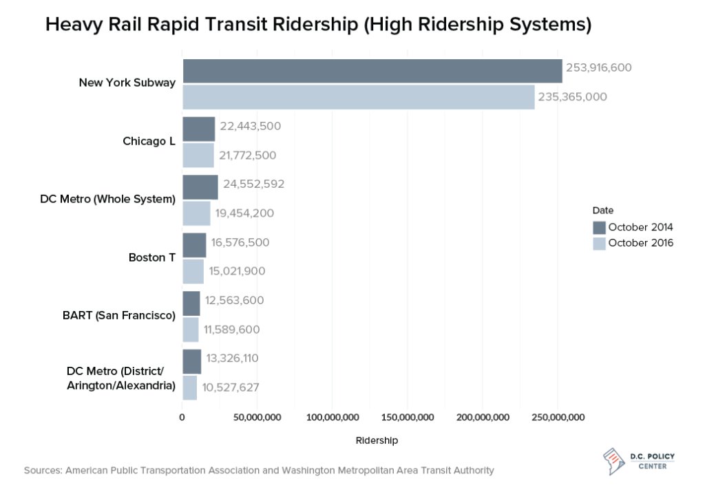
However, in 2012, neither city came close to the New York Subway’s 8,400,000 average weekday passengers, as might be expected given the size of the New York metro area and the city’s much higher transit usage than other American metro areas. Although the New York subway, like most American transit systems, has lost some ridership in recent years, its total ridership is so much higher than other systems that it is often easier to leave it out in comparing the ridership of different systems.
When we compare Metrorail’s ridership drop-off to the other eleven heavy rail systems in the U.S., it becomes clear that Metrorail’s drop-off has been significantly larger than for other systems, even ones, such as the Boston T, that have faced their own maintenance crises in the past few years.
The drop-off in Metrorail ridership has brought the system to a clear third-place behind Chicago, although it still ranks on the high end of rapid transit ridership in the United States. Ridership within the three core jurisdictions of the District, Arlington, and Alexandria is just below the entirety of San Francisco’s BART and the SEPTA rapid transit lines in Philadelphia. Ridership within the District alone is roughly tied with that on Atlanta’s MARTA which, like BART, was built at roughly the same time as Metrorail and with similar design principles.[2]
Ridership per mile is a better metric, but it makes Metrorail look worse
I already highlighted one issue with directly comparing the ridership of different subway systems: the pools of potential riders are not the same for all systems. It’s hardly surprising that New York, the largest city and the heart of the largest metro area in the country would have the highest ridership, but that Los Angeles—the second largest city in the country—has the ninth-most-ridden system in the country clearly says something about the relative importance of the subway lines there.
However, comparing ridership to the size of a city or its metro area is really only useful for long-term discussions of a city’s transit system. The low ridership of the Los Angeles subway compared to the city’s size is likely due to the fact that the city itself is spread out and very little of it is served by the subway lines that exist. Unlike the drop-off in Metrorail ridership, which appears to have been caused by service degradation, and so could likely be reversed with improved service, only large-scale, expensive, and slow construction could conceivably give Los Angeles subway ridership comparable to New York’s.
From a shorter-term perspective it is more useful to compare the ridership of rail systems to total lengths of their lines. This gives a better idea how heavily used a city’s existing infrastructure is, and how crowded the system will be perceived to be by riders. Furthermore, since operating costs, such as maintenance, power, and paying train crews should roughly scale with the size of the system, this gives a better approximation of ridership compared to operating cost.
When we compare the ridership per route mile of the 13 heavy rail rapid transit systems in the United States, we find that New York’s lead has shrunk to less than a factor of three over the next-most-heavily-used systems. However, we also find that Metrorail is much closer to the center of the pack.
The PATH system that connects New York to Newark, the Boston T, the Los Angeles Metro, Philadelphia’s SEPTA, and the Chicago L all have higher ridership per route mile on their rapid transit lines than Metrorail as a whole does. Metrorail does still have higher ridership per route mile than its sister-systems in San Francisco and Atlanta, but its lead there has fallen significantly since 2014.
In thinking about these low ridership numbers, it is worth keeping in mind that Metrorail (and BART and MARTA) were designed to do a fundamentally different job than pre-World War II systems like New York, Boston, Philadelphia, and Chicago’s rapid transit. Rapid transit systems in these cities generally only serve the core city and its closest-in suburbs; their builders expected the cities’ large commuter rail systems to be sufficient to serve the outer suburbs.
On the other hand, Metrorail, BART, and MARTA were built in cities that had never had comparable commuter rail networks, and they were built in the 1950s, 1960s, and 1970s, when mainline passenger rail in the U.S. was seen as a dying industry. As such, they were built as hybrid systems, with closely-spaced stations in dense, built-up areas in the urban core, but with long suburban lines intended to substitute for commuter rail service.
Since the suburban segments of Metrorail have longer distances between stations, and also serve areas that are generally less transit-friendly, one would expect them to have less ridership per route mile than the core of the system. I confirmed this by calculating separate ridership per route mile values for the portion of Metrorail in the District, Arlington, and Alexandria, and for the portion in the District alone.
In October 2014, the values for these truncated systems calculated only counting trips entirely within the truncated system—were still lower than the New York Subway, PATH, and the Boston T, but they exceeded the ridership of the Los Angeles Metro, SEPTA, and the Chicago L.
However, the severe decline in Metrorail ridership meant that by October 2016, the District-only system was in sixth place, after the New York Subway, PATH, the Boston T, SEPTA, and the Los Angeles Metro, while both the District, Arlington, and Alexandria system and the whole Metrorail system were in seventh place, with sixth going to Chicago.
Light rail is insignificant in D.C., but plays a significant role in other cities
So far, these comparisons have been solely between heavy rail rapid transit systems: systems that technologically look very similar to Metro, with high-capacity cars, high platforms for simpler boarding, power from an electrified third rail (usually), and complete grade separation from other traffic.
However, an increasing number of cities have large light rail networks, which can be anything from streetcars running in mixed traffic to systems that can be indistinguishable from heavy rail to a casual observer. Furthermore, while D.C. only has one very short light rail line—the H Street Streetcar—many cities’ rapid transit systems are integrated with extensive light rail networks.
Light rail systems are designed for lower capacity than heavy rail rapid transit systems, and they usually do have lower ridership. However, some of the busiest light rail systems in the country have ridership comparable to or higher than the least-used heavy rail systems.
Including light rail pushes Metrorail to number four in terms of total ridership, as the Boston T’s light rail lines—the busiest in the country—push its October 2016 ridership to almost the same level as the Chicago L, which has no light rail component. Ridership on SEPTA in Philadelphia and the Los Angeles Metro is also significantly increased by the inclusion of light rail, as these systems have substantial light rail components.
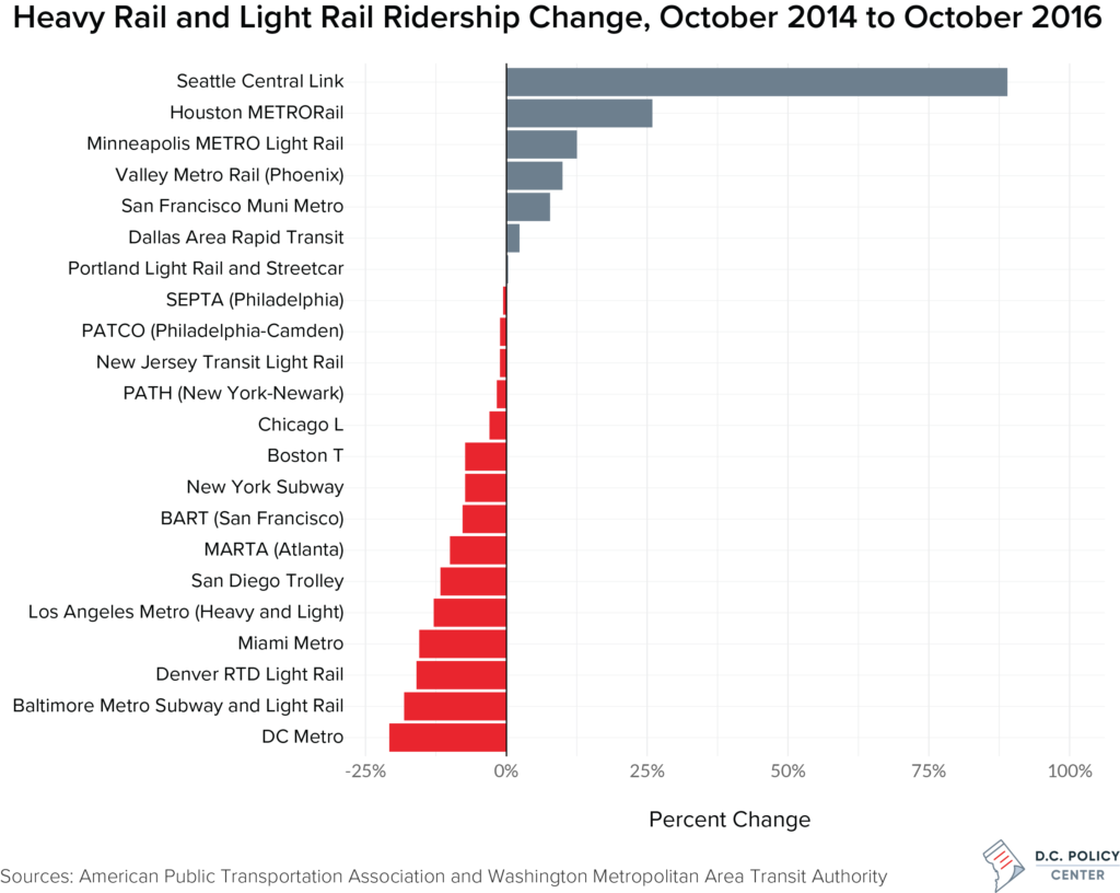
To get a clearer view of how much ridership has dropped—or risen—on various systems, I made a graph of the percentage change in ridership from October 2014 to October 2016 on rapid transit and light rail systems that have relatively high total ridership or ridership per mile.
While at first glance, it appears that several systems had major ridership increases between 2014 and 2016, on closer inspection, it becomes clear that all of these systems had significant expansions during that time frame. Seattle’s Link Light Rail opened two new stations, including a connection to the University of Washington, in March 2016 and a third station in September 2016. Houston’s METRO opened two new lines with a total of 17 total stations, in May 2015. And Phoenix’s Valley Metro Rail opened four new stations in August 2015 and another four in March 2016.
While Minneapolis did not open any light rail stations between October 2014 and October 2016, it did double the size of its system by opening the Green Line, connecting Minneapolis and St. Paul, in June 2014, and this data may capture some of the ridership rise that resulted from the Green Line’s opening.
On the other hand, most systems have dropped in ridership, although the amounts of the drops have varied from very small to Metrorail, which, at about 20%, has the largest drop in the country, followed by Baltimore’s Metro Subway and Light Rail and Denver’s RTD Light Rail.
While including light rail ridership necessarily increases the total ridership of systems with light rail components, it can lower the ridership per mile for these systems, if the light rail components of the systems have lower ridership than the heavy rail components.
In fact, this happens for the three major systems that have significant light rail components, and especially for Los Angeles, which has lower ridership per route mile than the pure light rail systems in San Francisco, Minneapolis, and Seattle. As a result, only the New York Subway, the New York-to-Newark PATH system, the Boston T, and the Chicago L have higher ridership per route mile than Metrorail when light rail is included.
Conclusion: Metrorail’s ridership is falling, but still relatively high by national standards
The recent drop in Metrorail ridership has lowered it from second to third or fourth place in terms of total ridership, depending on whether one counts light rail. This drop should be concerning, and serve as yet another reminder of why it is essential that Metro receive the funding and oversight necessary to return the system to normal operations.
However, it is also important to recognize that in terms of how heavily used the system is compared to the size of the system, Metrorail is, historically and currently, only the fifth or seventh busiest system in the country. A significant cause of this is the fact that the system was designed to serve low-density suburban areas as well as the region’s dense core.
Metrorail service to outer suburbs is important, and necessary to the functioning of the region’s transportation network. However, stakeholders—both in suburban communities and in the District—need to recognize that this adds costs to the system that cannot be made up for simply by raising fares. Furthermore, any future suburban expansion of the system, such as Phase II of the Silver Line, will make this problem worse; such expansions will almost certainly add less ridership to the system than is proportionate with their additions to its size.
About the data
All data on heavy and light rail rapid transit ridership used in this article is from a post on WMATA’s PlanItMetro blog for Metrorail ridership by trip origin and destination in October 2014, and from the American Public Transportation Association (APTA)’s reports for the entire WMATA Metrorail system and systems in other cities in October 2014 and October 2016.
All ridership values in this article are given in “unlinked trips,” as this is the standard APTA uses for releasing ridership data. Unlinked trip counts treat each transfer as a new trip; a passenger riding from New Carrollton to Union Station and transferring at Metro Center would count as two rides. [Update] Since a trip involving a transfer counts as two unlinked trips, it is possible that some of the decreases seen in unlinked trips are actually decreases in transfers due to riders deciding to walk further to avoid making a transfer.
Spreadsheets of the data used in these charts can be downloaded here.
Notes
[1] These values—and all ridership values in this article—are given in “unlinked trips,” as this is the standard APTA uses for releasing ridership data. Unlinked trip counts treat each transfer as a new trip; a passenger riding from New Carrollton to Union Station and transferring at Metro Center would count as two rides.
[2] For these comparisons, I am specifically considering October ridership because WMATA has released ridership numbers between station pairs for October 2014, allowing calculation of the ridership in individual portions of the system. October 2016 ridership in portions of the system was calculated by assuming all parts of the system lost ridership proportionally.
Feature photo by Ted Eytan (Source).
DW Rowlands is a chemistry lecturer at the University of Maryland, Baltimore County, but currently lives in College Park. More of their writing on transportation-related and other topics can be found on their website, dwrowlands.net. In their spare time, they volunteer for Prince George’s Advocates for Community-Based Transit.