
Organizations and publications from the Associated Press to the University of Oxford use style guides to standardize writing, formatting, and design, providing consistency for their readers. Some style guides can become a point of local pride. Like many organizations, the D.C. Policy Center adheres for the most part to AP Style, but maintains an extensive addendum that fills in for things AP Style does not cover, or in other cases, overrules AP Style.
In the tradition of many local Washington D.C. publications who have come before us, including the Washington Post, Washington City Paper, and Greater Greater Washington, the D.C. Policy Center is pleased to publish our own internal style guide. Like our colleagues elsewhere, we will surely fall short of these standards from time to time. In addition, our style guide is an incomplete and living document, and it will undoubtedly grow with us.
Introduction
The D.C. Policy Center’s goal is to advance policies for a strong and vibrant economy in the District of Columbia. We are interested in policies that promote inclusive economic growth that benefits all District residents. All of our publications should help readers understand these dynamics, and/or propose evidence-based policy solutions backed by data and grounded in D.C.’s unique economic, historical, and administrative context.
Our publications seek to provide thoughtful research on the District of Columbia to support data-driven solutions to policy problems and convey important information. As such, the tone of D.C. Policy Center articles should be clear, precise, and thoughtful. Publications should be free of jargon, errors, slang, or value statements. In general, the goal is to balance readability with precision, so that a general reader will not be lost in technical jargon while reading, but a more technical reader will be able to understand the underlying methods of the article’s analysis. The Center is an independent, non-partisan institution, and does not attempt to advocate for any political platform. Guidelines outlined in this document are subject to change, as language and common vernacular evolves.
Data and citations
Data
D.C. Policy Center research is usually completed using free, publicly available data. All D.C. Policy Center articles using data should provide clear information about the data source and methodology. Ideally, the data section will have enough information for a reader to be able to potentially be able to replicate the analysis. Limitations to the data, decisions made about data treatment and definitions, and other information relevant to the analysis should be included in relevant parts of the text (inline or footnotes) and can be repeated in the final data section as well.
- The end of every article should have an “About the Data” section that specifies data sources (with direct links), analytical methods, and other information that would be help a reader understand and potentially replicate the analysis. (Example: Who has the longest commute in the D.C. area?)
- In the “About the Data” section, list the exact dataset, year(s), question, geography, and other information, as well as the most direct link to the data page possible, so that a reader could theoretically replicate the analysis. If this becomes unwieldy, the author should discuss with an editor.
- Shorter descriptions (e.g., “American Community Survey 1-year estimates, 2016”) are acceptable for source notes in charts, as long as they are explained more fully in the data/methods section.
- This section is generally at the end of the main publication before the author bio line, and before any endnotes.
- Depending on the project, the editor may also ask the author to separately send the underlying data and code (including raw and cleaned data sets), or a link to the folder on the author’s GitHub page where data, methods, and code can be found. If a writer has posted their data and code to GitHub, their article should still have a brief summary of this information in the text.
- Underlying data used in charts should (also) be sent as separate .csv or .xlsx files. For interactive charts, the D.C. Policy Center should have the source files and data so the images can be hosted by the Policy Center if possible.
Other notes:
- In most cases, data used in reports should be from publicly available sources. Some analyses will use government or other third-party data that cannot be released in full at the time of publication. However, authors should avoid using or citing opaque data sources or analytical methods from private third parties, including rankings or “scores.” Authors should discuss the use of proprietary data with their editor.
- When comparing data points or describing trends, keep data sources and context consistent whenever possible. (For example, don’t use data source A for 2014 data, then use data source B for 2015.) If there are still any mismatches—data source, year, individual- vs. household-level data, etc.—be clear about this in the text, and consider explaining why the different data source was used in a footnote.
- When working with very small units of analysis, make a note of how statistical significance was determined and/or how you dealt with potentially large error terms.
- For some commonly used types of data, the D.C. Policy Center may have a preferred set of data sources or definitions. Some examples include preferred sources for reporting yearly population estimates (census data), a set of comparable cities or regions, or a standard list of counties comprising the D.C. metropolitan area.
Citations
Be generous with attributions. If building on previous work, especially from local organizations or news coverage, link to that work in footnotes or inline links. Citation style is flexible (inline links, footnotes, in-text, etc.), however, citation style should be consistent within a publication or series. Use APA 7 citation style for in-text and footnote citations.
If adapting a methodology used by another author, be very clear about the source of the approach in the text and in data notes. If possible, contact the originator to discuss (and ask questions), and send them a link once the article is published.
Make sure photos are used appropriately within their usage license, and with full attribution. Ask directly for permission before usage, and for major projects, consider building in a budget for photo licenses. Archival photos may require specific permission from the archive; please note that this can take time to process.
When making a factual claim, cite the evidence.
Factual claims should be backed up by evidence in the form of a link in the text or a footnote:
- Links are more accessible to readers but may not be available even a few weeks after publications; therefore, try to use web.archive.org to create a stable snapshot of the page. (This might not be possible for some types of webpages.)
- If citing data that is not in a written report (e.g., author’s interpretation of data in a chart or table), cite the data source in a footnote and include a sentence about what the data shows and when the data set was last accessed.
- Example: “BLS data from May 2012 to May 2016 show a steady increase in the number of policy analysts working in the District of Columbia. [link] (Last accessed March 8, 2017.)”
- Footnotes or endnotes are preferred for longer reports (including internal reports). Footnotes should be in APA 7 style throughout the piece.
The types of statements that should be cited include:
- Any number or statistic
- Example: “D.C.’s population was 681,170 in 2016.”
- Note: If the majority of the piece is based on a single data source, explain that at the beginning of the piece and describe methods more thoroughly in the “About the data” section or on the Data Blog. (Example: Who has the longest commute in the D.C. area?)
- Dates of events (that are not widely known)
- Example: “The program was first implemented in April 2012.”
- Claims about causes or impacts
- Example: “Research from the University of Maryland suggests that the change led to a rise in test scores in the 2014-2015 school year.”
- Claims about motivations of third parties
- Example: “The Chairperson announced that the purpose of the law was to improve public health.”
- Quotations or summarizations of public statements
- Example: Mayor Bowser stated, “The department is in a good position to make additional hires and move swiftly to close the gap between attrition and hiring, and that’s what this plan is going to help us do.”
Explain unfamiliar terms—and avoid using unnecessary jargon in the first place.
When using technical terms, or those that have a specific meaning in the context of the piece, always introduce the term to the reader at first mention. This might be through general context; an explanatory sentence or parenthetical aside; a link in the text; or a footnote for longer explanations.
Here is an example of how to introduce a term (catchment) that might be new to some readers:
For many years, schools like Penn Alexander and Meredith enrolled students who lived outside the neighborhood, either at the principal’s or central office’s discretion. Going forward, no students from outside the catchment – the neighborhood attendance zone – will be allowed in, the district said, and some kind of vetting plan will be developed to verify students’ residence. (Out-of-catchment students now at the school will be allowed to remain, Lynch said.)
… Space is already tight at Meredith, which enrolls over 600 students and has some oversized classes. The lottery is a band-aid for now, but with more housing being built in the area and ever more demand – some Realtors bill themselves as Meredith catchment specialists – officials realize they need a more permanent fix. And with a number of South Philadelphia schools experiencing booms, it’s going to be an issue elsewhere.
“We are going to closely monitor each of the applicants,” Lynch said. “In the Penn Alexander catchment, there’s knocking on doors and talking to landlords. It can get fairly involved. We check tax records.” (source)
This article introduces the term “catchment” with context and a brief explanation. It’s worthwhile for the article to introduce a new term because, as an in-depth feature about school placement, the concept is central to the discussion, and the term is common enough among stakeholders to be used in quotes from city officials.
Editorial style
General
- Publications are consistent with AP Style, unless otherwise specified.
- D.C. Policy Center style is to use serial (Oxford) commas in lists of three items or more.
- Colons are used after a phrase that functions as a complete sentence, not merely to indicate the presence of a list.
- When referencing departments and agencies, use the full name including the jurisdiction in the first use. Preferred acronyms and shorthand can be introduced in parentheses at the end of the full name.
- Capitalize formal titles when used immediately before a name, but not after. Example: Councilmember X; X, the councilmember from Ward Y. Capitalize formal titles in captions and citations.
Numbers
- Spell out numbers under 10, unless part of a percentage, decimal, age, or ratio.
- Use numerals for all other numbers up to 1 million (1 million, not 1,000,000; 1 billion, not 1,000,000,000)
- Use commas for 1,000s.
- When writing about decades, use an “s” without an apostrophe to indicate spans of time.
- Example: 1990s
- Spell out any number when it is the first word in a sentence.
- Spell out “percent” in full publications. Certain graphics may contain percent symbols.
- If discussing a trend, the general preference is to list the data chronologically—e.g., “In 2010, the number was X, but by 2015, it had risen to Y.”
- Place a zero before a decimal ranging between zero and one to improve readability. This rule has exceptions, for example when the decimal describes the noun (.38 pistol).
- Be careful to distinguish between overall and relative levels, such as the total number of X group in a county and that group’s share of the county’s population—especially when discussing changes over time, or as relevant to other groups or jurisdictions. The analysis might need to include both measures to give the reader the full context.
- Also be very careful to differentiate between “percent” and “percentage point”.
- Example: “…rose from two percent to four percent.” In this, one could describe the change as “a 100 percent increase” or “a two percentage-point increase.”
- Example: “… fell from 50 percent to 25 percent.” In this case, one could describe the change as “a 50 percent decrease” or “a 25 percentage-point decrease.”
People and issues
Always use names and pronouns that align with the individual’s self-identification and preferences.
When talking about people, our default is to use categories as modifiers, not nouns. Examples:
- “white residents” instead of “whites”
- “people living with disabilities” instead of “the disabled”
- “older adults” instead of “the elderly”
- “low-income households” instead of “the poor”
- “people experiencing homelessness” instead of “the homeless”
In general, our language describing people and communities should be respectful and precise. These decisions should also take into account individual or community preferences, and prioritize people’s preferred terms when possible. If word choices need to be changed or corrected after publication, please contact an editor as soon as possible.
More specific guidance is included below. These terms should be updated as usage changes over time.
Age
When referring to data, try to distinguish between age (continuous) and age groups (e.g., 18-29, 30-45).
When referring to younger individuals:
- ~Ages 0-1: Infants
- ~Ages 2-3: Toddlers
- Ages 0-12: Children
- Ages 13-17: Youth
- Ages 18-29: Young adults
For more general references, terms might be “children and youth,” “young residents,” or “young people.” Ideally, use “students” only to refer to the time young people are in a school, such as when discussing school enrollment. (See also Education.)
When referring to older individuals:
- Older adults: Depends on context but preferred for those 65 and older instead of “seniors.” Do not use “elderly” or “old.”
Resources: “Out with ‘the old,’ elderly, and aged” | The BMJ
Education
Use “students” to refer to the time young people are in a school, such as when discussing school enrollment. The default assumption for the designation of “students”, unless specified, are young people enrolled in grades pre-kindergarten – 12th grade.
Do not use the term “truancy” to refer to unexcused absences, as it can have a specific legal definition.
When discussing adults’ education levels, be precise with regard to the underlying data. Some commonly-used data categories include:
- Adults without a high school diploma / Adults who did not graduate high school
- Adults who graduated high school / High school graduates (depending on the data, may need to specify “…who did not attend college”)
- Adults with some college experience
- Adults who graduated college / College graduates (depending on the data, may need to specify “Adults with a bachelor’s degree”)
- Adults with an advanced degree
Gender identity and sexual orientation
A publication may potentially refer to the LGBT community, LGBTQ community, or LGBTQIA* community (among other terms) depending on data, context, and preferences of individual involved. (In almost every case, an individual’s preference for self-identification takes precedence over institutional style.)
Avoid “sexual preference” (a more appropriate term might be “sexual orientation”), “homosexual,” “transgendered,” etc.
Resource: GLAAD Media Reference Guide
Income, poverty, and socioeconomic status
All groups should be treated with empathy and dignity. Be precise when discussing poverty and related issues—e.g., “low-income households earning less than $40,000 per year,” “families with incomes below the federal poverty line,” or “low-income residents,” depending on the precision of the data or specificity of the population being discussed. Do not use terms like “the poor.” For workforce issues, do not use descriptors like “low-skill.”
Homelessness
If writing about data or legislation, refer to the source material to be more precise in descriptions. For instance, a report might specifically refer to “unsheltered adults,” “families experiencing homelessness,” or “people experiencing chronic homelessness,” depending on the context.
Health
As with other descriptors, health-related descriptions should be as adjectives and not nouns. Generally, use people-first descriptions such as “people with disabilities” rather than “disabled people.”
Resource: Disability Language Style Guide | National Center on Disability and Journalism
Race and ethnicity
The D.C. Policy Center uses the following terminology in reference to racial and ethnic groups residing in the United States, with corresponding census-based categories in parentheses. Race and ethnicity are used as adjectives, not nouns, but community and individual preferences should also be taken into account wherever possible. Be precise and refer specifically to underlying data—data on race and ethnicity are often reported separately.
D.C. Policy Center publications capitalize Black, with flexibility to use African American (census based racial category: Black or African American). “African American residents” is a more specific designation than “Black residents,” so avoid using two descriptors interchangeably—although a data set will, very occasionally, distinguish between African American residents and other groups of Black residents. “People of color” is a broad term that may not be relevant for specific analyses, as it is not interchangeable with “Black residents,” “Latinx residents,” etc. if an article is focusing on a specific group.
Publications use white (census-based racial category: White).
Publications use Asian American (census-based racial category: Asian).
Publications use Native Hawaiian and Pacific Islander (census-based racial category: Native Hawaiian or Other Pacific Islander).
Publications use Native American (census-based racial category: American Indian or Alaska Native).
Publications use Hispanic or Latinx (census-based racial category: Hispanic or Latino).
Other or more specific descriptions should be used as needed and capitalized based on standard grammatical rules (e.g. “a Chinese-American CEO” or “the Russian Embassy.”)
Avoid use of the word “minority” when describing people of color, as they often make up the majority of certain areas. Instead use specific terminology that is consistent with your source material.
Language around race and ethnicity is subject to change in the future, as cultural understanding shifts.
Nativity and immigration
Use descriptions that align with the underlying data, such as “residents not born in the United States,” or “residents who immigrated to the U.S.”—particularly on first mention. The term “immigrants” can be used as a noun for brevity after the precise reference has been established.
When relevant, use “undocumented residents” or “residents who are not authorized to work in the U.S.”; do not use terms like “illegal immigrants” or “illegal aliens.”
Resource: “‘Illegal immigrant’ no more” | AP
Incarcerated people
Refer to people convicted of crimes and imprisoned as “incarcerated” or “formerly incarcerated.” Use people-first language in favor of terms such as felon, convict, criminal, prisoner, offender, and perpetrator.
Geography
“D.C.” is assumed to refer to D.C. proper. Always specify when data is referring to the D.C. metropolitan area or another broad geographical area. In general, analysis should not focus solely on the D.C. metropolitan area without particular analysis of D.C. itself, unless discussed first with an editor.
Naming
- District of Columbia / Washington, D.C. / D.C. / the District
- Washington, D.C. metropolitan area / D.C. metropolitan area / D.C. area / D.C. region / Washington D.C. region etc.
- Note: If abbreviating in charts, do not capitalize Metro (D.C. metro area)
- United States / U.S.
Analyses should distinguish between the District of Columbia and the broader metropolitan area; the latter should be referred to generally as the “Washington, D.C. metropolitan area” or “D.C. metropolitan area.” When referring to a specific unit of analysis, such as a Census-defined D.C. metropolitan statistical area or the D.C. commuting zone, specify early in the text and link to or footnote the exact definition.
Statistically, it is usually most appropriate to compare D.C. to other cities, or the D.C. metropolitan area to other metropolitan areas. Use caution when comparing D.C. to other states in charts, as this is rarely an appropriate unit of analysis for quantitative work (though it may be for other policy analyses).
Additional notes
- Anacostia is a neighborhood in Ward 8, and a river. Anacostia should not be used to refer to Wards 7 and 8, or east of the river generally.
- D.C. Home Rule may be referenced when talking about the act of Congress in 1973. This is not to be confused with home rule of other cities (the legal rights of cities within a state).
- When referencing an organization in D.C., use that organization’s use (or lack of) periods to refer to the District. Example: DC Chamber of Commerce.
- The D.C. Council may be referenced with the phrase “The Council” upon second use, but is never to be referenced with “the City Council.”
Visual style guide
Fonts and spacing
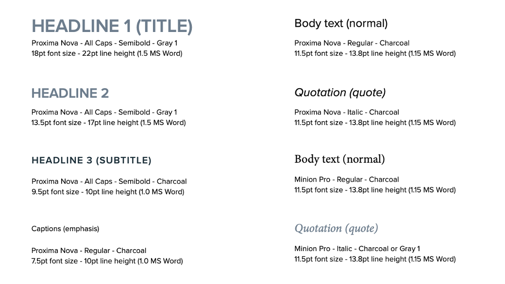
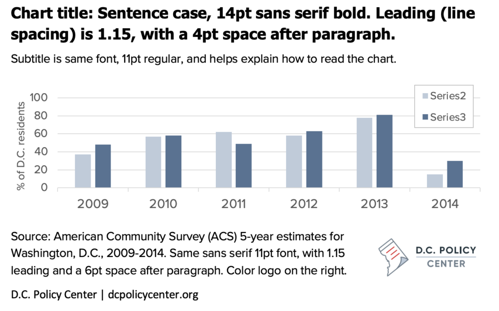
The D.C. Policy Center website uses Proxima Nova for sans serif text (headings, text, and various page elements). Printed publications use a combination of Proxima Nova for sans serif text and Minion Pro for serif text (page titles and blog post titles). If you are unable to use those fonts, use standard legible fonts instead (sans serif: Arial, Verdana, or Franklin Gothic; serif: Times New Roman, Palatino Linotype, Georgia).
Recommended typography for text
Graphs and charts
General
The Policy Center typically uses three types of graphs to convey data: line graphs, bar graphs, and maps. All graphs should use Proxima Nova font, contain legends and keys to read the chart, cite the source of the data in the chart notes, and should contain the D.C. Policy Center logo (or a derivative Policy Initiative logo) in case charts are uploaded to Twitter or other online locations. The Policy Center recommends using Tableau (and is willing to help) to create charts for style and usability, but other software is usually acceptable.
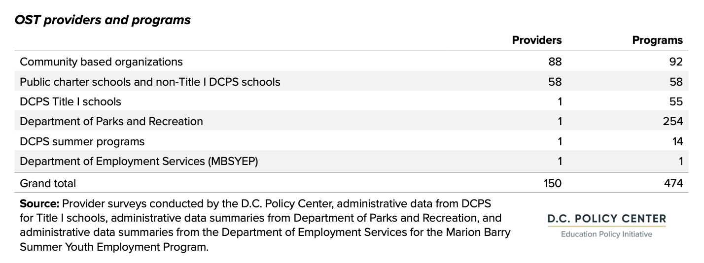
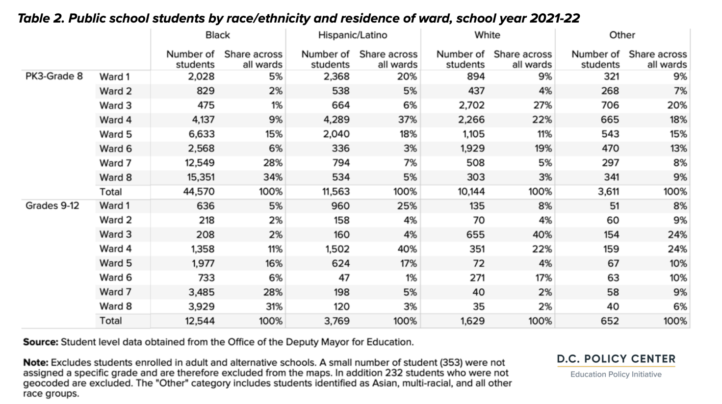
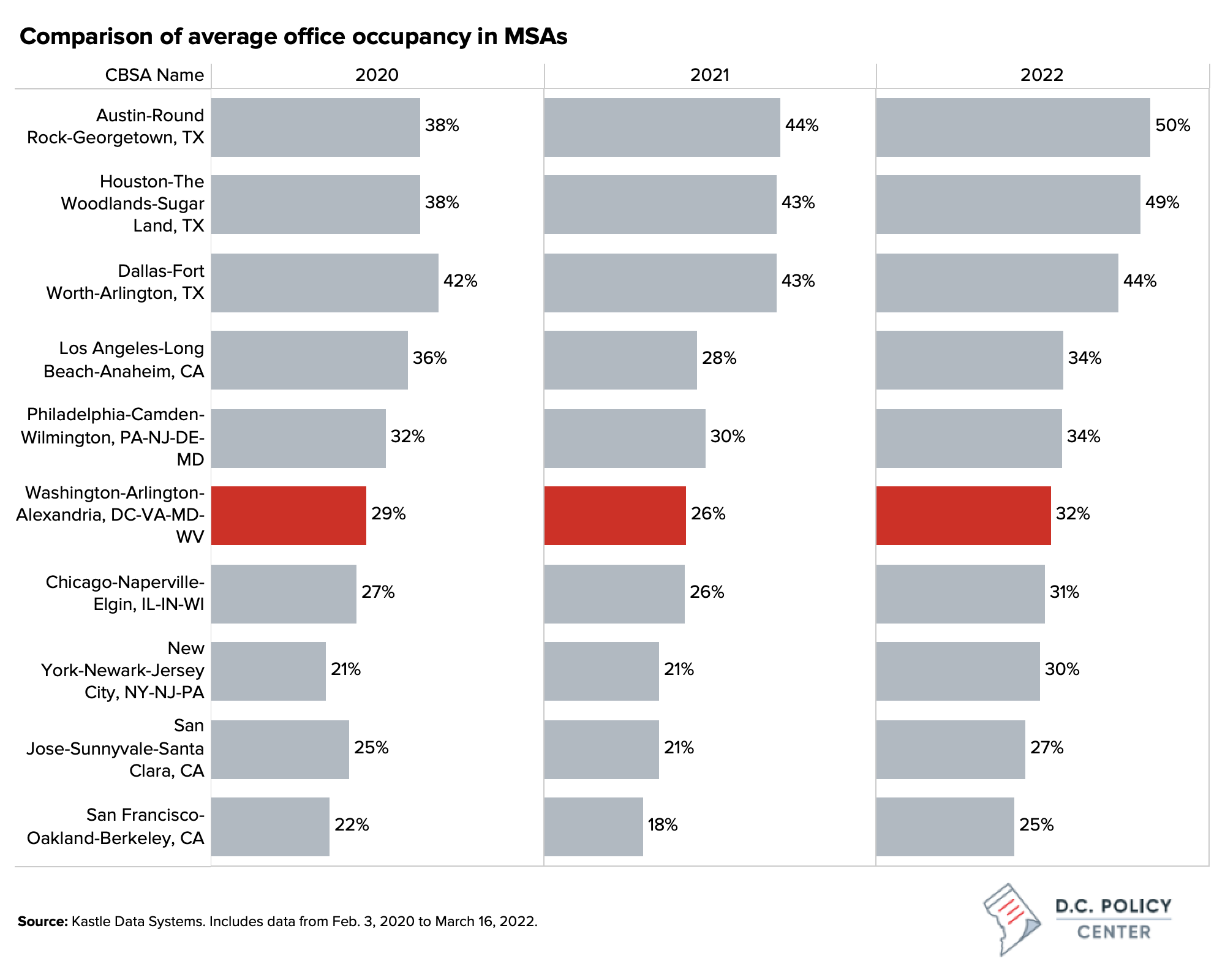
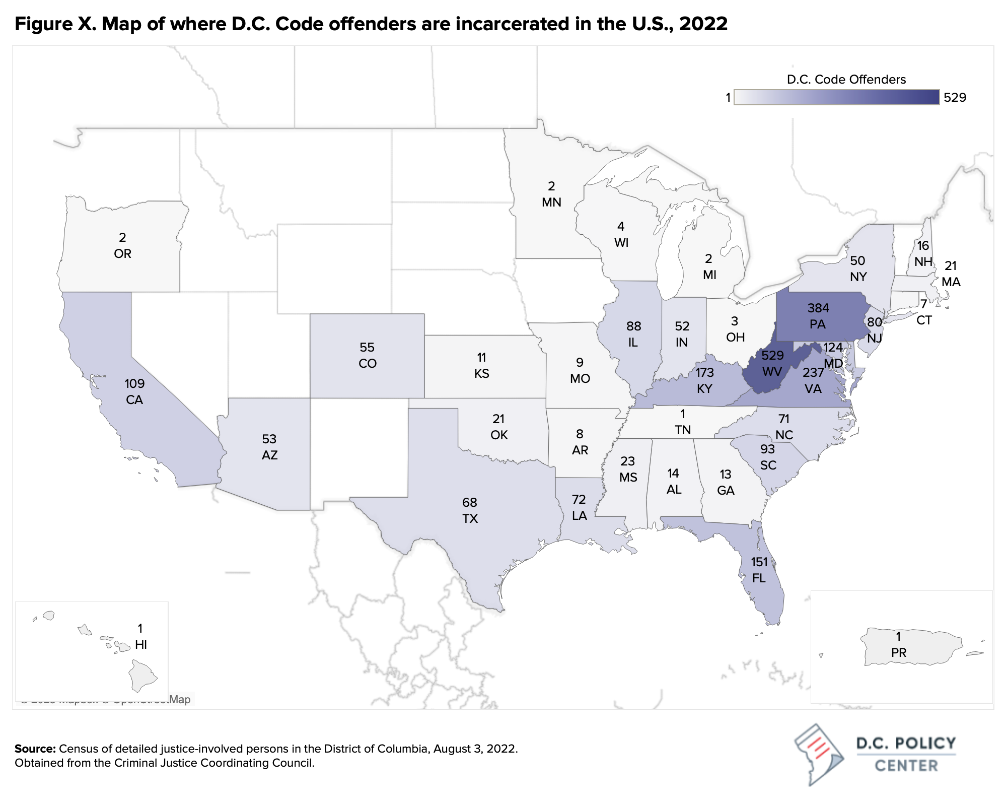
Sample graphs:
Maps made in Tableau should have the landcover/background removed.
Font and text
Text in visualizations (including titles) should be black on a white background. If a third-party program does not allow this option, discuss alternatives with your editor. Use Proxima Nova as the font for all text if possible, or Arial if Proxima Nova is unavailable.
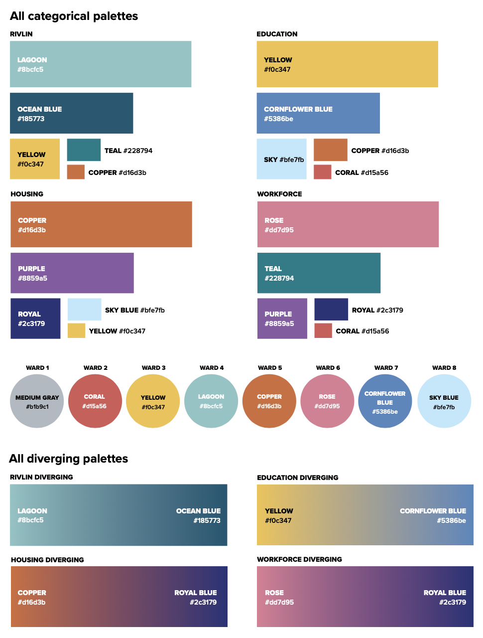
When using colors to signify groups, maintain consistency across publications.
Recommended fonts and spacing for charts
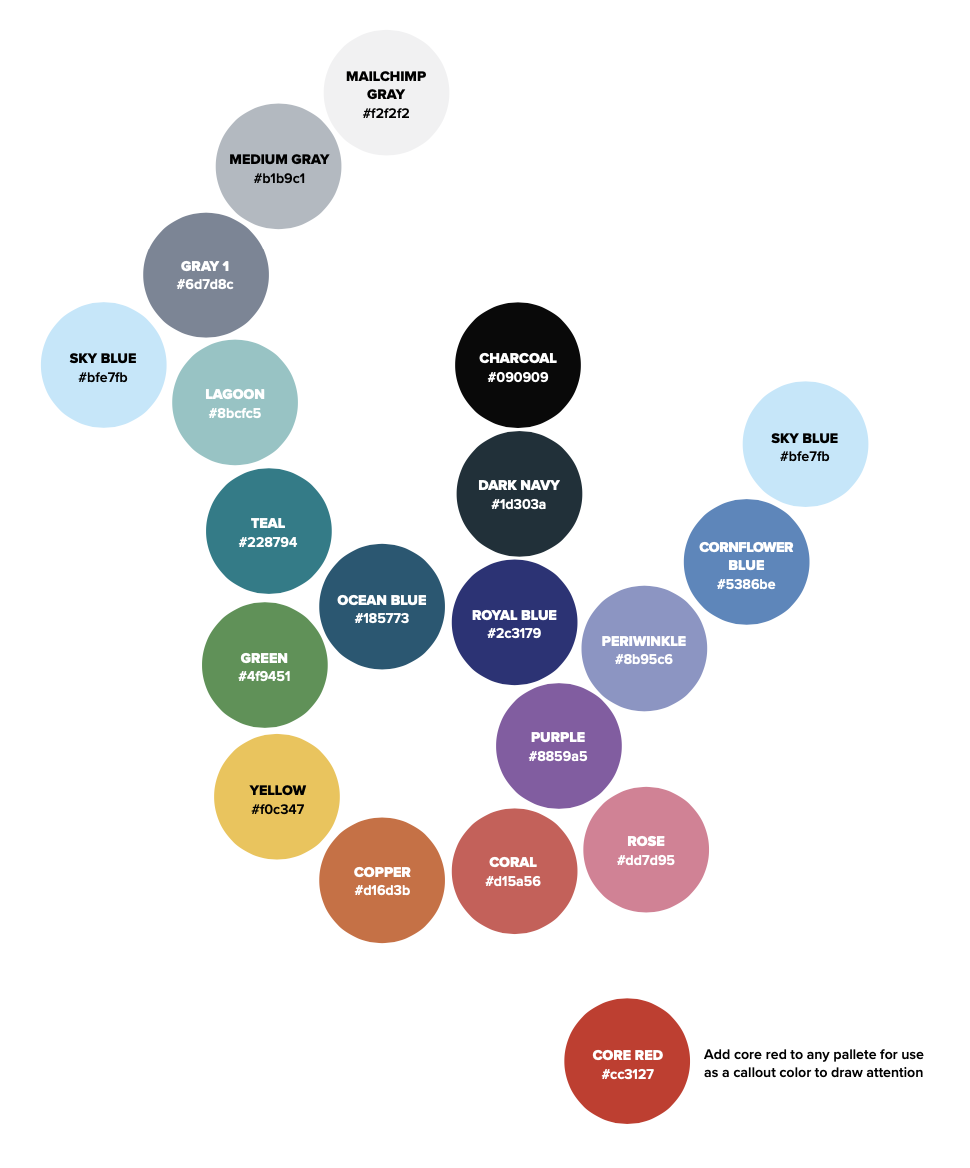
Graph colors
Information conveyed by colors
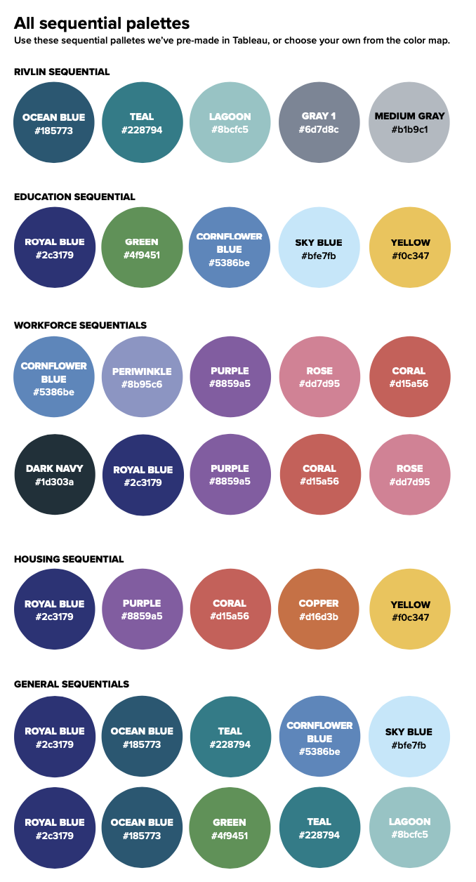
- To convey intensity or range in a sequential color palette, use a single color becoming darker or lighter instead of one color (e.g., blue) shifting to another (e.g., red).
- When using multiple colors for categorical data, consider potential misinterpretations of color combinations like red/blue, which is often used to represent either political parties or temperature, or red/yellow/green, as in traffic lights.
- In general, avoid the use of red to indicate the prevalence or intensity of a neutral issue, or to indicate the concentration of any population group, as it can have negative connotations.
See also: Urban Institute data visualization style guide
Accessibility
- Avoid red/green and other combinations that can be difficult for colorblind readers.
- Consider using lightness/darkness as well as hue to indicate differences (e.g., dark purple vs light yellow).
Suggested color palette
A suggested palette for chart colors is included below and should be taken as a general guide; individual choices should prioritize visual quality and readability.
General chart notes
- Charts for publication need to be 1000 pixels wide, but can be any height.
- Maps made in tableau should have the landcover/background removed.
- The D.C. Policy Center logo should be 20% of the width of the graph.
- Numbers should be abbreviated with a letter. For example, $25,000 should be written as $25k.
- Charts should not have grid lines.
- Bar charts should not have outlines on the bars.
- Side by side charts should be standardized so that axes are the same, and axes should be standardized within publications. Y-axes do not have to reach 100, but should always include zero.
- Graphs should have labels for bar levels and important points.
- Charts and tables should be well-labeled, with titles and descriptive subheadings—enough information that their image files could be shared on social media without additional context. Include any description or source information needed for captions and attribution.
- Source information should include source name, descriptive title of data set, relevant geography and/or populations (e.g., “Adults 18 and older living in the District of Columbia”), and year(s) covered.
- Excel charts in Word documents should (also) be transmitted to the Policy Center as separate files (.xlsx or .xls), as links to charts that are embedded in Word documents are frequently broken. For interactive charts, authors should send source files and data to be hosted by the D.C. Policy Center.
- Other images should be in PNG format and include any description or source information needed for captions and attribution. If any images require permission for publication (such as from an archive or media outlet), please discuss this with your editor and submit permission requests as early as possible in the research and writing process.
- Legends should list categories in the order they appear on the chart, and should use Sentence case.
- Categories should be listed in a logical order, usually from largest to smallest or from oldest to newest.
- Axes should (almost) always start at zero.
- All axes should be labeled, with units.
- All labels and other text in the chart should be legible.
- Avoid visual or text effects (shadows, gradients, etc.)
- Avoid letting the chart become too large in proportion to the space/text (remember, the chart does not always need to take up the full width of the screen).
- Avoid using these colors next to each other:
- Copper and Goldenrod
- Cornflower, Gray 1, Rose
- Blue Gray and Lagoon
- Use Core Red as an accent color only.
Chart types
- Use pie charts sparingly, especially with more than 3 categories. Avoid using pie charts to show changes over time.
- Be careful with dual axes; consider side-by-side charts when possible.
- Bubble charts, though often visually pleasing, can be difficult to interpret (especially for static/non-interactive charts).
Tables
- If possible, make tables in Tableau
- Banded rows are encouraged (light grey shading and white combo)
- Horizontal lines are discouraged, vertical lines are to be used as necessary to highlight categories
- Like graphs, use Center colors and include logo in bottom right
Sample tables: