In “The Great Sort: Part I” and “The Great Sort: Part II” I documented that over the past half century poor Black residents and affluent Black residents have increasingly sorted themselves out into different neighborhoods throughout Metro Washington. In short, the Black population has become more economically polarized geographically.
Indeed, the second article ends by observing that “For the entire population the metro Washington economic polarization index rose from 36 to 41 during the same period. To what extent was the overall increase driven by greater economic polarization within the Black community?”
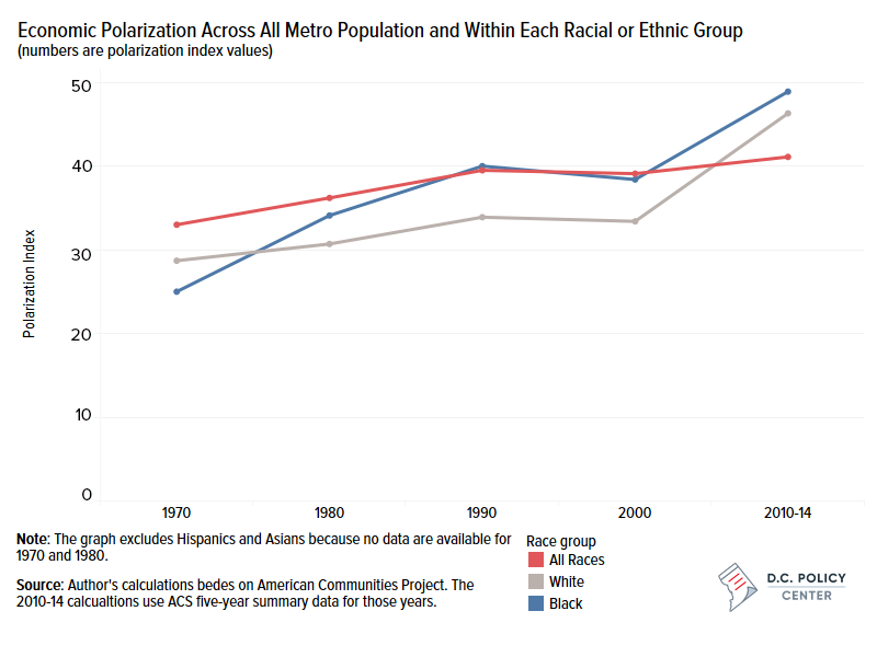
The table below shows the degree of economic polarization within each major racial group for Metro Washington. To remind the reader, my economic polarization index combines two metrics of economic segregation looking at the degree to which “poor” residents and “affluent” residents live away from each other.[1]
Within the White population the economic polarization index increased from 28.7 in 1970 to 46.3 in 2014–a 17.6-point increase. The increase of economic polarization within the Black population was somewhat greater – from 25.0 in 1970 to 48.9 in 2014, or a 23.9-point increase.
Comparable data for Hispanic and Asian households were not provided within the 1970 census and sample sizes for both groups were too small for economic polarization indices to be calculated for 1980. The two population groups, however, showed economic polarization levels both higher than (starting and finishing) and relatively stable compared with economic polarization indices for White households and Black households.
The statistics track an interesting reversal. In 1970, the overall economic polarization index (33.0) was substantially higher than component indices for White households alone (28.7) and Black households alone (25.0). By 2014, the overall economic polarization index (41.1) was lower than the component indices (White residents 46.3, Black residents 48.9, Hispanic residents 66.9, and Asian residents 63.9). How can that be?
Living Together – More by Class Now than by Race
Easily explained. In 1970, White residents and Black residents lived apart; the Black/White segregation index–regardless of economic class–was 81. In 2010 (the first year of American Community Survey 2010-2014 five-year sample), the Black/White segregation index was 61–still much too high but nevertheless a substantial improvement. In appreciable numbers, more Black residents and White residents were living together in more neighborhoods by 2014.
Before the 1980 census Hispanic residents and Asian residents were too few to affect any overall measure significantly. In 1980, Hispanic residents formed 2.9 percent of the Metro Washington population; by 2010, the Hispanic population had exploded to 13.8 percent. The White/Hispanic segregation index had increased from 31.5 in 1980 to 48.3 in 2010. (However, that was still well below the White/Black segregation index of 61 in 2010.)
The metro area’s Asian population had ballooned as well from 2.4 percent in 1980 to 10.4 percent in 2010. The White/Asian segregation index had increased modestly from 30.9 in 1980 to 36.9 in 2010.
Both groups–though Asian residents slightly more than Hispanic residents–have grown rapidly within Metro Washington during the decades after passage of state and federal fair housing laws. Whether foreign-born or native,[2] they have not been forced into racial ghettos as were generations of African Americans. “Chinatown” or “Koreatown” are largely concentrations of ethnic businesses, not residential ghettos dominated by one national origin group.
Though Metro Washington’s foreign-born Hispanic community derives from a wide range of countries, it at least shares a common “mother tongue” (Spanish) and often a common religion (Catholicism).[3] That contrasts with many Asian populations that share neither religion nor common language – except English.[4]
I can illustrate why by 2016 an overall economic polarization index would be less than its racial group-by-racial group component indices by focusing on couple of census tracts as shown below.
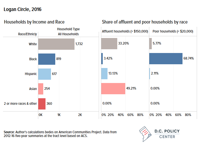
Tract 50.02 – DC’s Logan Circle
Tract 50.02—is located in DC’s rapidly gentrifying Northwest area known as Logan Circle (bounded by Massachusetts Avenue, 14th Street, P Street, and 11th Street). In 1970 an un-bifurcated tract 50 was 77.7 percent Black. By 2016, tract 50.02 was 19.0 percent Black and its tract 50.01 component (extending northward to Florida Avenue) was 13.2 percent Black.
However, of tract 50.02’s 819 Black households, 563 (or almost 70 percent) were poor Black households compared to only 28 affluent Black households (slightly over 3 percent). To be sure, error terms at the tract level could be large, but the difference remains stark even when we allow large margins of error. Most poor Black households were seniors and disabled persons living in two public housing projects–Claridge Towers (343 units) and Horizon House (105 units). These two high-rise public housing properties were probably home to most of tract 50.02’s 100 poor White households as well.
But the tone-setting residents of Logan Circle now were affluent White household (575 households) and, to a lesser degree, affluent Asian households (125 households). Of course, my very methodology is designed to focus on the extremes of the income scale so the majority of local residents (58 percent of all races though only 28 percent of Black households) fell within the two extremes.
The Logan Circle area is a prime example of gentrification by affluent White households (one-third of all White households) and affluent Asian households (almost half of all Asian households) and not by affluent Black households (only a handful). Indeed, there were more affluent Black households in the un-bifurcated tract 50 in 1980 than there were the recombined tracts 50.01 and 50.02 in 1980.
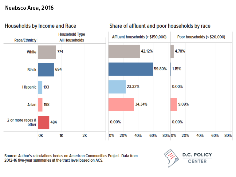
Tract 9008.01 – Prince William County’s Neabsco area
By contrast with DC’s almost two-century old Logan Circle area, tract 9008.01 in Prince William County hardly existed as a residential community in 1970. Known as the Neabsco neighborhood, tract 9008.01 is bounded by Leesylvania State Park along the Potomac River, Route 1, Powell’s Creek and the eponymous Neabsco Creek. Its un-bifurcated tract 9008 had only 684 residents (and only a few Black residents) in 1970. By 2016, tract 9008.01 and tract 9008.02 (west of Route 1) combined had 13,527 residents, including 5,645 Black residents – more than eight times as many Black residents as total residents of all races almost five decades earlier.
As the figure below shows, by 2016 Neabsco’s Black community was almost the mirror image of Logan Circle’s Black community; affluent Black households comprised almost 60 percent and poor Black households barely 1 percent. Tract 9008.01 had the 19th highest number of affluent Black households (415 households) – barely behind DC’s Gold Coast (tract 16) which had 451 affluent Black households.
Looking at the two neighborhoods, for all races combined Logan Circle’s poor households were 21.2 percent and its affluent households were 25.4 percent of all households[5]; suburban Neabsco’s poor households were 3.5 percent and its affluent households were 45.9 percent of all households. It is easy to see that there is less imbalance between the poorest and most affluent households for all races combined than within each racial group, particularly within the Black community.
Economic Polarization in 60 Large Metro Areas
Let’s expand our analysis beyond Metro Washington to all 60 metro areas of more than one million people. Table III summarizes the results.
- Economic polarization overall increased in all 60 metro areas from an average index to 30.5 in 1970 to an average index of 37.9 in 2014 – an increase of 7.4 index points. By 2014 the most economically polarized metro area was Bridgeport-Stamford-Norwalk CT (50.0); the least polarized was Portland-Vancouver-Beaverton OR-WA (30.4). Metro Washington DC-MD-VA-WV (41.1) was the tenth most economically polarized.
- Within the White population alone the economic polarization index increased in 59 out of 60 metro areas, rising from an average index of 27.7 to 34.6. The average increase was 6.9 index points. The exception was the Minneapolis-St. Paul MN-WI MSA where the “decrease” was only from 28.0 to 27.4 (probably within the margin of error).
- Thus, if the United States was composed solely of White households with no minority population – think Iceland multiplied by 1,000[6] – economic polarization would still have increased over these five decades.
- However, the difference between the overall economic polarization index in 2014 (37.9) and the White only index (34.6) represented the contribution of minority community polarization. So about ten percent of the phenomenon of growing economic polarization was attributable to minority communities.
- Black economic polarization increased in all 58 of 58 metro areas for which indices were calculated. Most telling are the 48 metro areas that had significant Black populations in 1970; economic polarization was somewhat lower among Black household (22.5) than among White households (27.7) as the Black population – regardless of economic status – was still packed into racial ghettos. (The federal Fair Housing Act had just been enacted in 1968.)
- Thereafter, the Black middle class and, especially, affluent Black households exploded into suburban communities (often into more newly constructed subdivisions as in Metro Washington’s Charles and Prince William counties). Many poor Black households remained trapped in “legacy housing” (e.g. public housing projects). Even programs hypothetically designed to disperse poor Black households, such as federal Housing Choice Vouchers, have, in practice, concentrated most voucher holders in high minority, high poverty neighborhoods.
- The table shows that racial groups for which initial economic polarization indices were calculated beginning in 1980, 1990, or even 2000 – Hispanic residents and Asian residents (and even Black residents in ten metro areas) – showed higher initial levels of polarization as statistical newcomers (and often actual immigrants) lived within increasingly open but more economically stratified housing markets. Hispanic polarization trends tended to fall between White and Black trends. Polarization for Asian household was high but stable. Regardless of starting year and level, the increases in Black economic polarization – 32.4 index points over 44 years, 38.7 points over 34 years, 41.2 points over 24 years, or 43.1 in 14 years – were unmatched for any other racial group.
Thus, residential segregation by income is steadily replacing residential segregation by race.
Table III: Increase in Economic Polarization By Race in 60 Large Metro Areas 1970-2014
| Racial group | 1970-2014 | 1980-2014 | 1990-2014 | 2000-2014 |
| All racial groups | 60 of 60 | |||
| economic polarization index | 30.5 to 37.9 | |||
| change in index points | 7.4 | |||
| White only | 59 of 60 | |||
| economic polarization index | 27.7 to 34.6 | |||
| change in index points | 6.9 | |||
| Black only | 48 of 48 | 6 of 6 | 2 of 2 | 2 of 2 |
| economic polarization index | 22.5 to 54.9 | 39.1 to 77.7 | 62.7 to 103.9 | 79.0 to 122.1 |
| change in index points | 32.4 | 38.7 | 41.2 | 43.1 |
| Hispanic only | na | 23 of 24 | 7 of 12 | 8 of 9 |
| economic polarization index | 37.1 to 48.8 | 64.8 to 64.0 | 68.0 to 84.8 | |
| change in index points | na | 11.7 | -0.8 | 16.8 |
| Asian only | na | 5 of 11 | 2 of 8 | 5 of 7 |
| economic polarization index | 52.6 to 52.5 | 77.9 to 70.2 | 80.9 to 88.0 | |
| change in index points | na | -0.1 | -7.7 | 7.1 |
Note: In select MSAs, no trend data available – Black (2 MSAs), Hispanic (14 MSAs), & Asian (34 MSAs)
The twelfth in this series of articles looking at trends within Metro Washington in comparison with its peer metro areas around the country will examine the degree to which concentrated poverty is a racialized phenomenon.
David Rusk is a Senior Fellow at the D.C. Policy Center. Rusk is a former federal Labor Department official, New Mexico legislator, and mayor of Albuquerque, the USA’s 32nd largest city. He is also the author of Cities without Suburbs. Now a consultant on urban policy, Rusk has worked in over 130 US communities in 35 states. Abroad, Rusk has lectured on urban problems in Canada, England, Germany, South Africa, and The Netherlands.
Note: In the original article, Neabsco was spelled as “Nebasco”
Notes
[1] These calculations are based on the work of Prof. John Logan of Brown University. For all 380 metro areas Logan calculated a variety of measures of economic segregation, including the degree to which “poor” residents (defined as the lowest 10 percent of the income scale) are residentially segregated from everyone else and, conversely, the degree to which “affluent” residents (defined as the highest 10 percent of the income scale) are residentially segregated from everyone else. I have combined these two indices to produce an “economic polarization index.”
[2] According to American Community Survey 2012-16 barely half (52 percent) of Metro Washington’s estimated 898,474 Hispanic or Latino resident were foreign born compared with almost 70 percent (69.7 percent) of Metro Washington 586,674 Asian residents. Almost two-thirds (63.9 percent) of Hispanic residents were citizens with three-quarters of those being native born and one-quarter naturalized citizens. By contrast, almost three-quarters (73 percent) of Asian residents were citizens with less than half (42 percent) of those being native born and an eye-opening 58 percent being naturalized citizens
[3] In terms of countries of origin, El Salvador (294,566) accounted for almost one-third of Metro Washington’s Hispanic residents (898,474) followed by Mexico (132,627), Guatemala (66,687), Puerto Rico (62,127), Honduras (53,357), Peru (47,58), Bolivia (45,729), Colombia (27,204), Dominican Republic (23,075), and Cuba (19,684). These ten countries represented 86 percent of the countries of origin of all local Hispanic residents.
[4] In terms of countries of origin, India (150,591) accounted for one-quarter of Metro Washington’s 586,674 Asian residents followed by mainland China (103,003), Korea (79,050), Vietnam (65,940), Philippines (64,136), Pakistan (38,330), Japan (11,850), Bangladesh (10.014), Thailand (9,089), and Nepal (8,435). These ten countries represented 92 percent of the countries of origin of all local Asian residents.
[5] “All households” excludes those of two or more races and others for which economic polarization indices have not been calculated.
[6] Actually, immigrants numbered 8.9 percent of Iceland’s total population in 2018 with the largest number by far (37.5%) being Polish.